For our titles and statements in the exhibition we will be using vinyl lettering, which will will apply to the walls ourselves when we set up the exhibition a few days earlier than the launch night.
I do not have a title for the project, as I believe that my statement sums up what I wanted to represent within my work, and I feel that a title may make the work too obvious or may just repeat what I say in my statement. I wanted to write a statement that was short and to the point. As the entire exhibition showcases only photography work, I did not feel it necessary to make my statement longer or uninteresting by talking about the fact that you are looking at photographs, as it is far too obvious that my statement is about the photography that it is displayed next to. I decided to talk only about the subject of my photographs.
'Sport isn't just about skill, competition and result. There is a lifestyle and a culture that makes up a sport, and gives it an identity that attracts us'
Friday, 5 February 2016
Display layout plans
As I am now not making a book, I have decided that I would like to put more prints on the wall. Although I am still displaying the same prints as I would have done in a book, I don't think that the way I will now be displaying them, in the box, is as successful and interesting as if I were to create the book.
I am now going to have around 8 smaller prints on the wall. I want each print to be of the same size, as I don't want any of the photographs to stand out more than the rest. This is because I want viewers to be aware that every aspect of the sport I am representing is equally as important.
I am now going to have around 8 smaller prints on the wall. I want each print to be of the same size, as I don't want any of the photographs to stand out more than the rest. This is because I want viewers to be aware that every aspect of the sport I am representing is equally as important.
Book
I decided that I wanted to make a Japanese 4 hole stitch book, as these are very simple to make, and there is no limit to how many pages you can add, as I am planning to have around 30 pages with thick paper. The design of these books also looks very neat and simple.
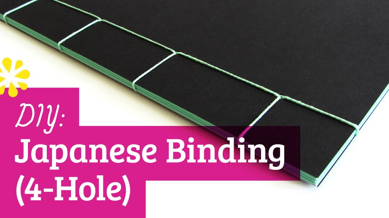
This is an example of the book that I will be making, I am going to use white paper and white thread to keep the appearance simple.
I printed around 30 of the best photographs from this project on the A2 printers, using lustre paper. I wanted to print the images directly onto the paper rather than sticking them in, as I think this makes the book look much neater. I cut every page to size using a guillotine, leaving a larger blank space on the left side of each print, where the stitching would be.
For the front cover of the book, I am planning to use the blue, linear mountain graphic from my logo design. I want a fully blank white cover with the linear mountain design going across the entire page to make a nice simple design, that will hopefully start to create a theme within my display.
For the front cover of the book, I am planning to use the blue, linear mountain graphic from my logo design. I want a fully blank white cover with the linear mountain design going across the entire page to make a nice simple design, that will hopefully start to create a theme within my display.
After cutting each page and stacking the pages together, I realised that they did not line up correctly at the top, some pages were slightly larger than others and meant that the book did not look neat at the top. I then used a steel ruler and a scalpel to trim the edges to size, which also did not work to well, and the edges now looked fairly scruffy and still weren't all the same size.
After feedback from the final seminar for this project, i decided to abandon the idea of making a book, as the prints were now too short to trim any more and I would not be able to make the book look any better. Instead, I decided to cut each print individually so they each have a very small white boarder. I am planning to find a small white box to put the prints into, where people can pick up the prints and look through them.
Logo/Business card
I decided that I wanted a very simple, minimalist logo, as this is the style that I like the most, I generally don't like designs that are too busy and look very packed. I chose the pale blue color as I think this has a very simple, delicate appearance. I also wanted to include some aspect of the work that I am interested in, so i decided to add a simple mountain graphic.
Exhibition plans

For our sceond year exhibition, we are presenting in Pete Spowage gallery in Nottingham, which will be a show of all 19 students from my seminar group this term. We chose the name 'No system, No method' based on the brief we were given at the start of the year. The flyer and poster designs were done by one of the students in our group, Ollie.
As the venue is fairly small, we have around 1 meter each of wall space, which will be a challenge but will allow me to think critically about the work i want to put into my exhibition and choose what will be best.

My initial plan is to have a few wall prints A2 size, and have them layed out in a vertical line down the wall.


I am planning to use these 4 images on the wall in my exhibition. I believe that as a collective they sum up the culture behind this type of sport, it is not all about the skills and the action, but the lifestyle.
I am also planning to make a book, to display alongside the prints. In the book I am going to use most of the successful images I have produced throughout this project, in order to showcase an even wider range of photography, and perhaps to tell a story about this type of sport. The book will allow people to see even further into this lifestyle.
In order to display the book closely with the print, I am also planning to add a white floating shelf to the display. We have been told by the gallery owner that we are allowed to use anything we need to, in order to put up our display, such as screws, nails, glue etc... so the floating shelf will not be a problem in that aspect. I decided that I would like to use a white shelf, to keep the display looking simple, clean and minimalist, as this is the type of style that I like the most. Also using a floating shelf with no brackets or visible fixtures will help to keep the clean, simple appearance of my display.
Val D'isere
In December I spent a week in Val D'isere on a university ski trip. I decided that I wanted to spend the week gathering images around the resort, of the mountains and the general lifestyle in the area. I did not want to focus on capturing action shots on this trip as my current project is centered around the culture and lifestyle surrounding sports.


Pin up show
Before the christmas holidays our seminar group had a pin up show, where we showed prints of the work we had done so far. For the show i decided to display only black and white images, as I think I will continue with the black and white photography for the remainder of the project. I decided that I wanted to display a variety of the shots I had taken so far. I included images from the surf championships and the dryslope championships. I used a few action shots as well as some of the lifestyle shots that I had made, such as the spectators during the events and the nights out.


Subscribe to:
Comments (Atom)